Interview / COX & GRUSENMEYER
Simplicity spiced up with grotesque
Young Belgian duo Cox & Grusenmeyer consists of two graphic designers – Ines Cox and Lauren Grusenmeyer. Their graphic design is significantly typographic, a little bit surreal and grotesque, very juicy – simply Belgian. Besides the graphic realizations they also carry out actions and workshops, which serve them (and the participants) as a playground, where they can enjoy themselves.

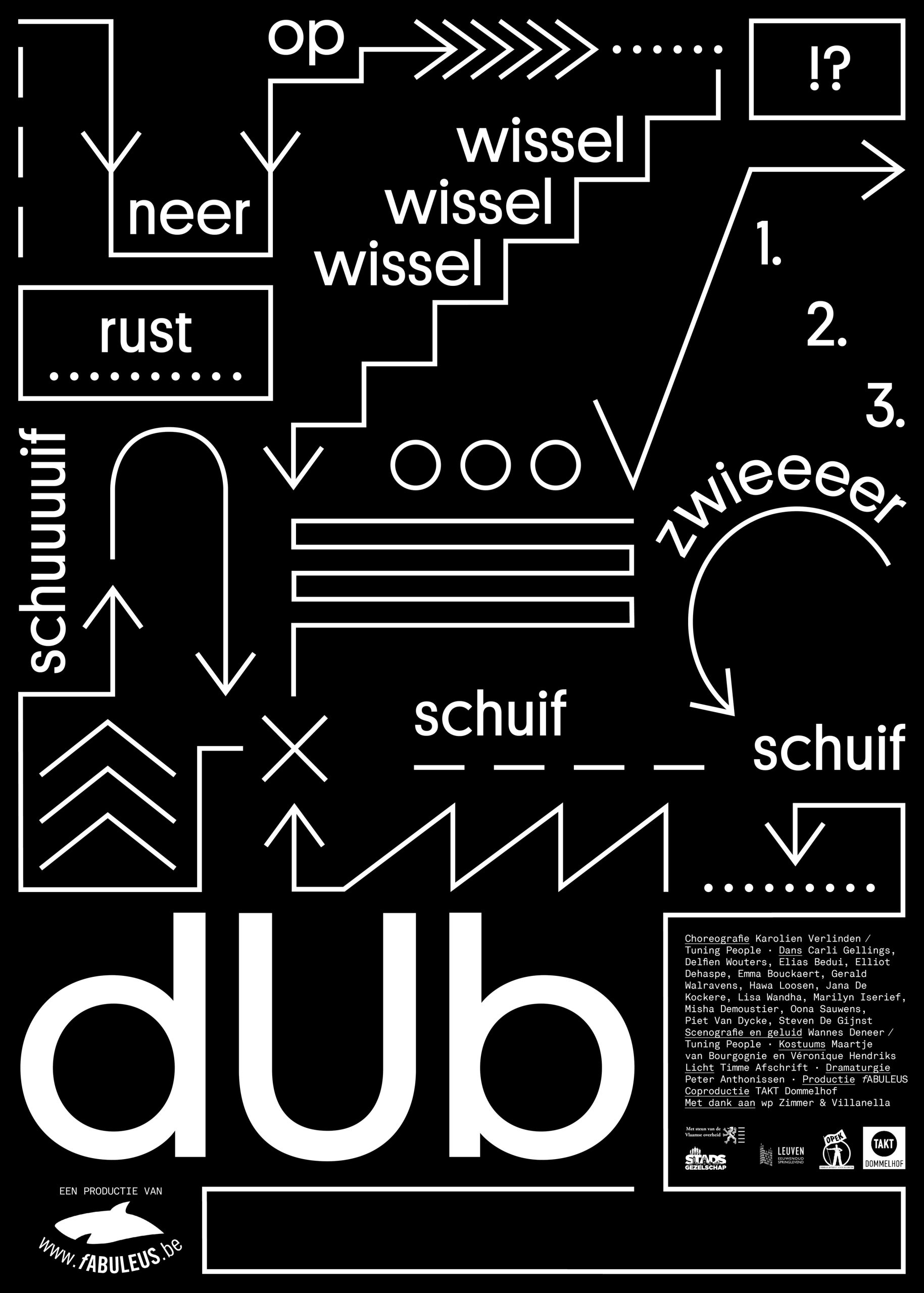
Poster for dance performance ‘dUb’, source: bureaugrusenmeyer.com
What are your basic creative approaches?
C&G:Within our studio we think self-initiated projects as very important for us – it is a research into new creativeapproaches and it allows us to develop our own visual vocabulary. When we start working on a new project wetake a lot of time to make sketches and test out different ways of treating the content. We don‘t have any ready-made recipes, we always research into new possibilities. One of our approaches is something we call ping-pong. One of us starts with some first sketches for a new project and hands it over to the other one andthen we swap again. By doing this our ideas develop quite fast through trials and errors.
Next to that we are quite honest towards the content we work with. Although our work tends to be grotesque insome way, we treat the content consistently. The very nature of the content influences the way we work with it.
We believe that everything can be designed. We see design as a simple, communicative tool that functions within a certain context. Therefore our designs often cross boundaries towards installations, sound, costumes etc…
Your work is very vivid, full of action – the process is often more important than the final result. Therefore I would like to ask, what is your attitude towards visual art?
Visual art influences our practice constantly in a direct way, sometimes even more than graphic design. Although the outcome is often completely different, we believe artists struggle with similar issues and are constantly in search of the most relevant expression. A sculpture can be of inspiration for a book, as a music composition can be for a video. Creative ideas can be exchanged between designers, artists, musicians,writers, fashion designers and architects — but the personal fascination of the maker and the use of mediainfluence the final outcome.
Joëlle Tuerlinckx, Daniel Buren, Jeff Wall, Matisse, Saul Steinberg, Maison Martin Margiela, Eames,… to name a few – are artists which we follow closely and we learn from while doing projects.
Quite often you do participatory projects, in which many other people take part, they get connected. What are you trying to transmit, or submit to the participants?
We organize many different workshops, installations and performances. A lot of our performances though aresatirical plays on society or on the profession of the designer. The most recent one is called Bureau for Busyness. It is a critique on the need to always appear busy. Keeping up the appearance of being busy is atleast as important as actually being busy. For this project we created a set of objects which we sell in our shop and which give you a busy appearance. For example we have a full agenda for sale, which is an agenda filled up with postit ´s cards and pins. It is in fact full and makes you look busy as hell. Another item is the nibbled pen which you can put in your breast pocket. Busy people tend to chew pens when being much stressed, well we sell them pre-nibbled. No need to actually be stressed, just relax and let the pen do the job! These kinds of projects are a playground for us. A way to ventilate our opinion on things and explore certain personal fascinations. We never bring out a strong political stance, much rather we pose questions by turning thingsaround or enlarging some existing situations.
What do you think is the main goal or mission of a designer in contemporary society?
We think this differs from person to person. Our personal mission is to create a design studio that combinesself-initiated work together with commissioned work. Our highest ideal is to develop a very personal practice, both visually and intellectually that translates our vision on society. We think it is important to have an opinion and be very personal in the way we deal with projects.
How would you describe a contemporary Belgian design? What would you recommend us?
There are a lot of good things happening in the Belgian design field. We have several very good schools which have contributed to build a new design generation. Lots of young design studios are emerging and building a new awareness of design. That is definitely something very exciting. Although there is not one consistent visual Belgian design identity – and happily not, as that would be an impoverishment – there are a few characteristics to be determined. There is a tendency to go back to the basics and set the content on the foreground in a simple and honest way. A love for typography and bare designs reflect that. But it wouldn‘t be a Belgian thing if there weren‘t some absurdities involved and that is exactly what distinguishes us from Dutch or Swissdesign. A Belgian design is never fully proof sequacious. We like it when there is some absurdity involved, some elements that you can not explain logically. That is the legacy of our surrealist history.
Some people to look after are: We Became Aware / 019-ghent.org, Eurogroupe, Oliver Ibsen, Dear Reader,Thomas Desmet, Joris Kritis, Jef Cuypers, Julie Peters, Ward Heirwegh, Boy Vereecken, Manuela Dechamps Otamendi, Raf Vancampenhoudt.

Source: Magazine Bratislava Design Week 2014.