Review / 4 x REVOLUTION
November 17th is behind us. The celebrations of the 30th anniversary were great. It was celebrated and remembered in the media, in the public space, in galleries, schools, cultural centres and, as Facebook revealed, in homes. Celebrations are a pretty specific genre and also a competition to see who can do it better. Pathos is a priori somewhere in their foundation. This is also true for November 17th. The strong sense of belonging and happiness and hope and belief in goodness and love and truth is sinking deeper into history, which is a little chilling for us, the remembrancers of those intense days. And remembering takes different forms, and yes the most official ones are the worst. We’ve picked out four from the milieu of institutions associated with design, art and architecture that have avoided the pitfalls of pathos quite successfully, but it hasn’t been perfect.
1.SCD/ AFAD/ Rosmány
The authentic exhibition Visuals of Change, which presented a selection of contemporary posters, visuals and photographs in very well selected functionalist shop windows of OD Dunaj on SNP Square – the main square of the Velvet Revolution (curators Palo Bálik, Silvia Kružliaková, Gabriela Ondrišáková), was focused on revolutionary graphic design. The three main logos of the revolution in Slovakia, the Czech Republic and Poland, i.e. Verejnosť proti násiliu [Public against Violence], Občanské forum [Civic Forum] and Solidarność [Solidarity] – by Karol Rosmány, Paweł Šťastný and Jerzy Janiszewski – were the main ones in the exhibition. The designers of the Velvet Revolution Karol Rosmány and Pavol Šťastný met at the opening of the exhibition for the first time ever, which is unique. The installation was in charge of the students of Typolab AFAD. They made good use of the shop windows and supported the expression by working with light, of course in the colours of the revolutionary tricolour. It was usually good. The exhibition was prepared by the Slovak Design Centre, the Typolab studio of AFAD in Bratislava and Karol Rosmány and his sons.
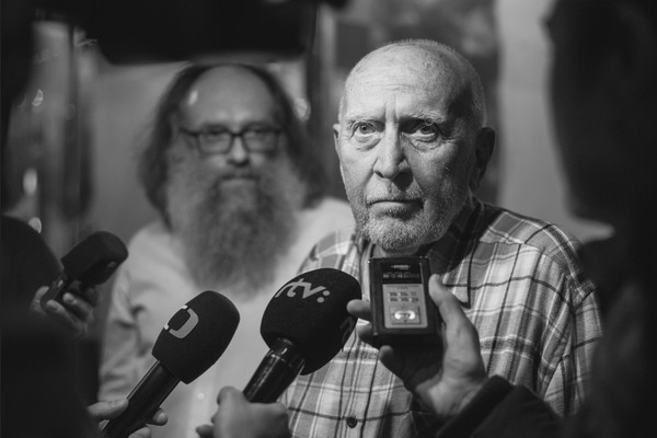
Karol Rosmány and Pavol Šťastný during the opening of the exhibition, photo: Adam Šakový.
2.SNG
The SNG went about it in a bombastic way. In the online space they launched a special, nicely composed, clear new website, the backbone of which is made up of the diaries, Čas-opis [slovak word for journal consists of two words time and description] of Július Koller, from that period. It’s a penetrating personal archaeology of the conceptual artist, layered with very vivid period archival material – photographs, videos, posters, flyers, artwork. Formally, the website refers to the well-chosen principle of the bulletin board (design by LAB SNG, Peter Gála). A truly meritorious achievement of the curators and the project team of Michal Čudrnák, Petra Hanáková, Lukáš Štepanovský, Zuzana Koblišková, Philo van Kemenade. We perceive the exterior attraction of this project as problematic. The SNG opted for large tarpaulins, painted remakes of period slogans, placed on the entire facade of the Esterházy Palace. Probably good marketing, because people on Facebook reacted well to it, but in reality it looked artificial and mashed-up. This secondary work with period relics is dangerous, the line with visual sell-out is thin and it makes the gallery a kind of backdrop for a film that will never be made.
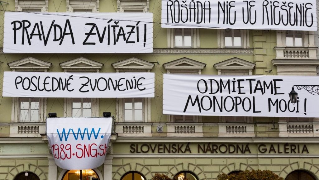
Slovak National Gallery, photo: archive.
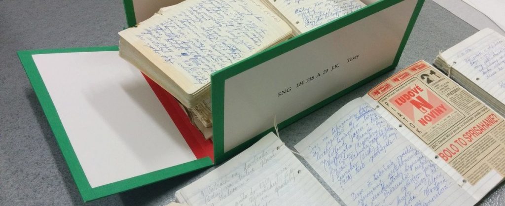
Čas-opis by Július Koller, box, SNG, www.1989.sng.sk
3.KHB
KHB also gave a massive space to 17 November. In the KHB Club there was a good video installation of the live oral history project Spýtaj sa vašich [Ask Yours], a large scale documentary video from authentic Slovak households candled and attracted viewers from the street to the glass gallery. The main programme was then the large exhibition Moc bezmocných [Power of the Powerless] curated by Lenka Kukurová (it runs until 20 February 2020 and we won’t be covering it) and the new KHB EXT platform, i.e. as a novelty for the exterior, they also prepared an installation of the famous object Výkričník barda [The Bard’s Exclamation Point], by Rudo Sikora, who was one of the founders of the VPN [Public Against Violence] in the period of November 17th, 1989. The emblematic work, and its location, have brought a change in the daily rhythm of the square – for now it is a bit of a makeshift, as the square is awaiting a more massive reconstruction. But it is an important shift, and a metaphorical “exclamation point”, because the artwork that belongs there has finally made its way to the streets. That is to say, not a tourist trap, or an artistically banal monument, as paradoxically happened and is still happening in the post-revolutionary period.
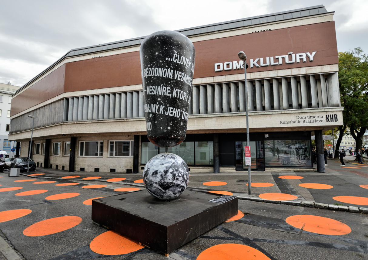
Rudo Sikora’s Exclamation mark in front of KHB, photo: KHB archive.
4. FASTU
In addition to the contributions of large cultural institutions, we were also interested in a somewhat inconspicuous project in Bratislava. An exhibition of period documents in the entrance foyer of FA STU. Actually, we were specifically interested in the installation by designer Peter Liška, who has been designing exhibitions for a long time (he currently did, for example, the Oskar Čepan Award in Košice – both the visual and the exhibition.) For the installation at FA STU he worked with a simple outline, frontal and transverse strips. In the frontal ones there were more solid and distinctive areas with simple colour graining – a grid that lined regularly as if scanned documents on a poster background. In the transverse ones, on the other hand, there were strips of text hanging on papers that seemed to have run out of a large fax machine. All hung on wires at eye level in Belluš’s high-ceilinged lobby (this is pretty standard practice in this space). The contrast with the window wall in the background, which is similarly articulated to the posters in front of it, was interesting. Overall, he managed to achieve a very unified and contemporary look in a simple way. Rustling paper, stacks of documents belong to the research of the past, and here the designer paid a specific tribute to them with his installation, both in their nakedness and in their inexorable logic, frozen and enlightened for a moment in the passage of time.
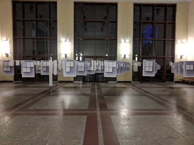
Foyer FASTU, installation by Peter Liška, photo: STU archive.