Review / THIS.
Notes on Andrea Ďurianová's exhibition "Skladom", Čin Čin Gallery, 4th september - 27th september 2019
How to write a linear text about a grid? The lines could fit into each other in notches, intersect – meet in intersections – connections..
–
–
–
/
–
–
–
Andrea says she was looking for a way to bring the material together. In the end, she bonded it with itself – anticor with anticor, sololite with sololite. The sculpted layers fit together perfectly by snapping the parts together and held together by tension, by the tight contact of the edges with each other. It’s like a child’s jigsaw puzzle – the joining of the parts creates a grid. This visually very simple principle only works perfectly if it is perfectly executed. Andrea is a master at this. She knows and understands her material more than she designs it, and further explores its possibilities, load-bearing capacity and potential. She goes from surface to space with it – by dividing the surface she creates space. She goes precisely, but not too sharply. I sense a pleasant modesty in her approach, that she doesn’t teach the material to do this, to stand like this. She doesn’t dictate. She doesn’t push. She “just” discovers something and makes it – the absolute order of things. She finds them a way of harmony and shows them “This way.”. Simply and precisely. As the only option (in the played out variations of objects).
Fitting in.
– – – – – /- – – – –
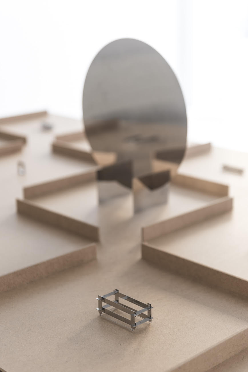
Photo: Adam Šakový.
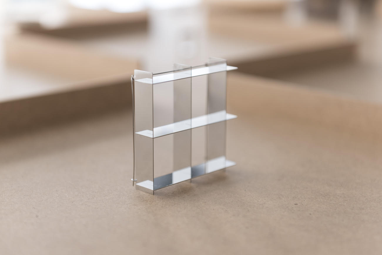
Photo: Adam Šakový.
Skladom [In stock] is the installation. From the door you might say it’s (probably) a jewellery exhibition, but all the other components suggest that each part is there for the other – they support each other. The intersections in the material are a materialization – a denunciation – of this relationship.
The “jewels” are not placed on the “table” but complement the “table”… the “table” is not a surface for the “jewels” but a space for them. The “shelf assembly” is an enlargement of the “brooch” (and vice versa). The “mirror” is the same circle as the “chair”, set on edge.
I put the naming of objects in quotation marks because each is a possibility drawn into space – a ruler and a compass. Each divides the space further within itself, inward. Just right angles, balanced by circles. Right angles in circles. Grid.
These could be formal shape games, and they are not. They have emotion, they make stillness and lightness. Like understanding your material and being friends with it. This is what he asks for, this is what he offers, this is how I understood and composed him.
Done.
– – – – – – – – – –
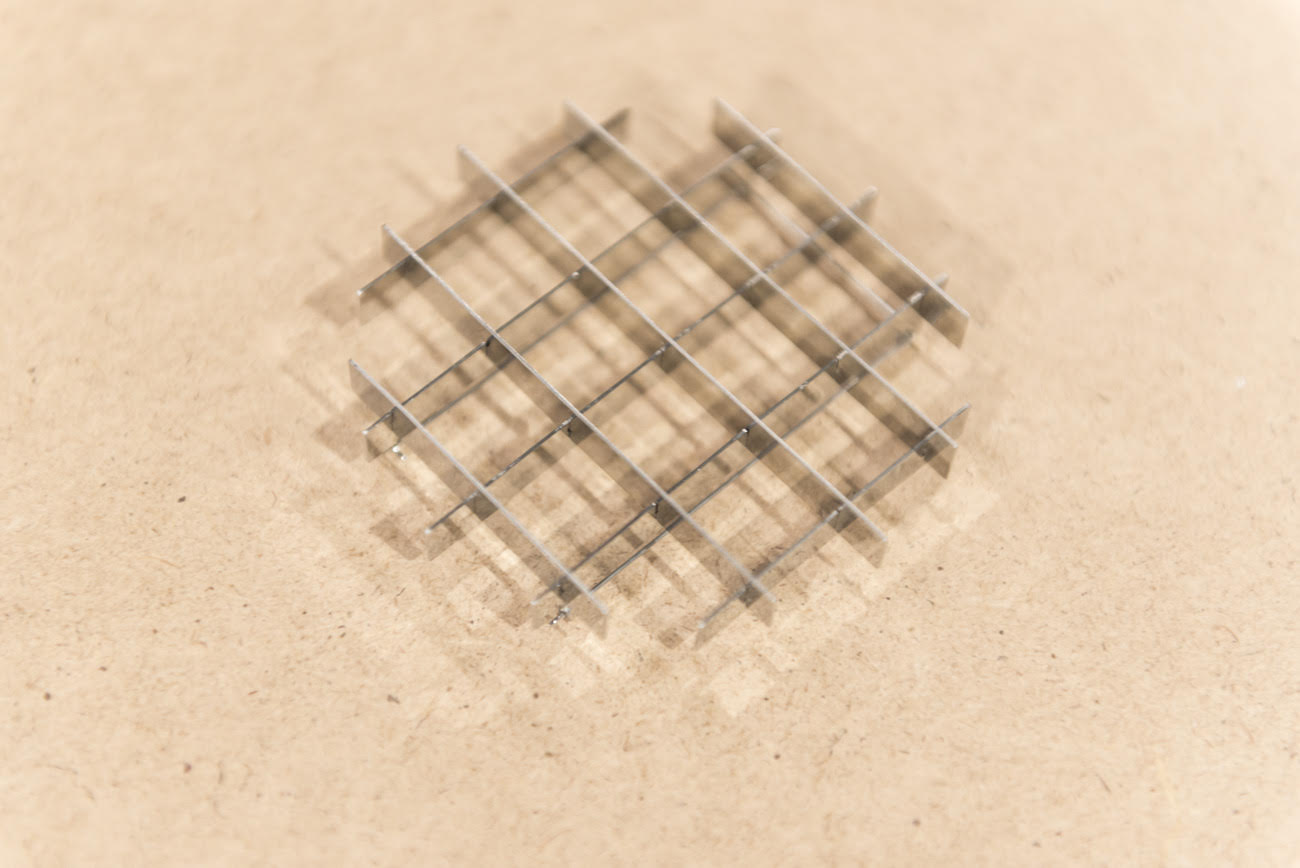
Photo: Adam Šakový.
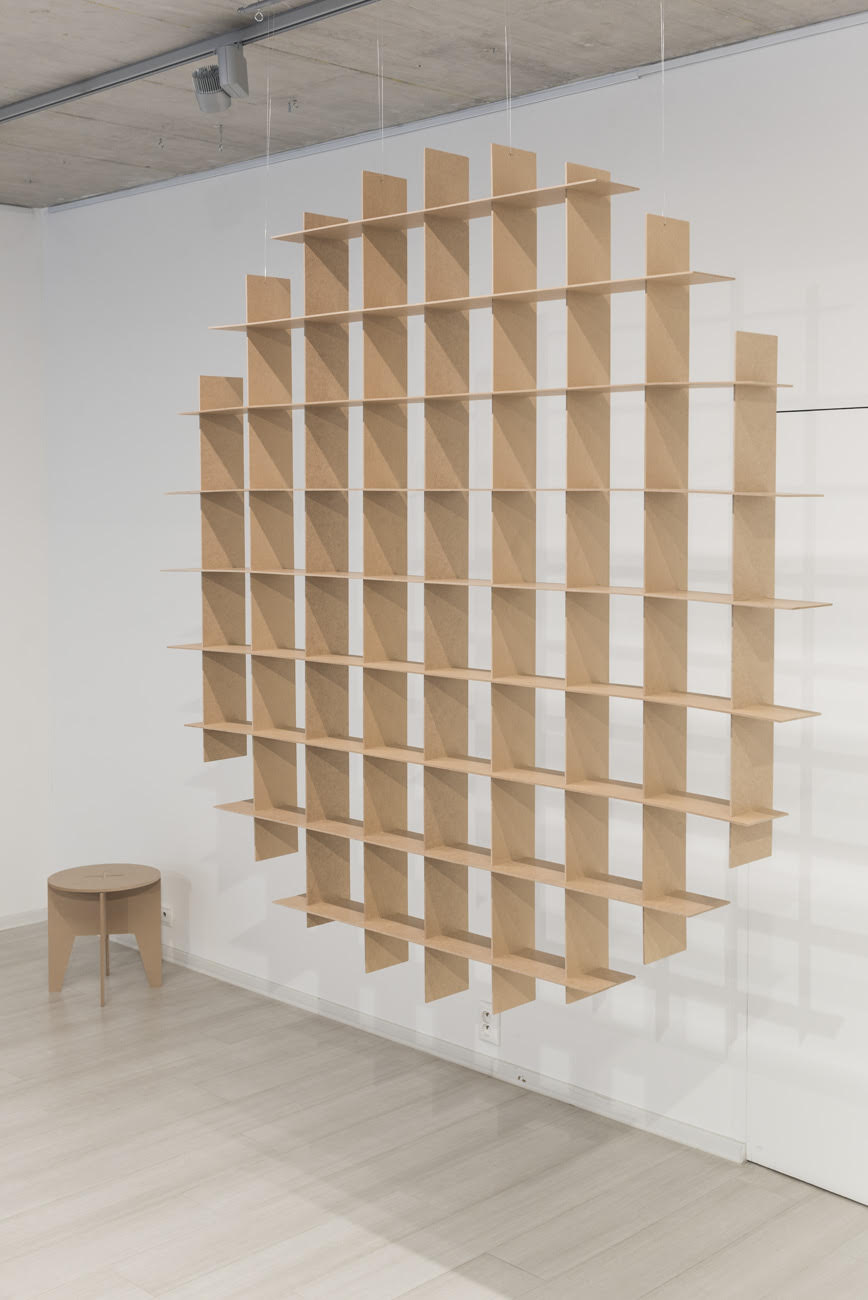
Photo: Adam Šakový.
The impact of the light creates a double effect on the “jewellery”. The contrast of black and white, which flattens and thins the object. By mirroring larger areas, on the other hand, a soft plastic gradient is created, in which the object becomes more transparent. Some places disappear before the eyes, as if the anti-cor is changing its quality – an illusion of transparent metal. Thus, when the angle of view changes, the character of the object also changes – surface – space – emptiness.
-/-/-/-/-/-/-
– /-/-
– –
The whole space is built by sliding parts into each other, but it holds together not only because of the well-calculated dimensions for the laser, but also because of the juxtaposition of polarities:
: metal – wood
: cold – warm, shiny – dull, sharp – soft, heavy – light, small – large,
: horizontal – vertical
A volume that you stack in front of you by moving your hand as in a combat exercise. Cutting through the air with the back of the hand. Vertical and horizontal. For example, the legs of a “table” as support lines that cut the space of the table top into smaller formats and thus create space for a “jewel”, a grid within a grid. The indicated lines continue – they divide the whole gallery, and beyond. All this is united by a single principle, the repetition of the same joint. And love – for order.
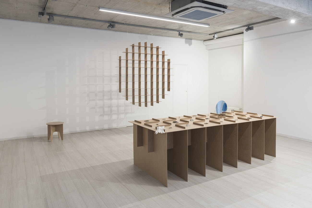
Photo: Adam Šakový.