Interview / CATASTROPHE COLOURS
About colours with Pierre Jorge Gonzalez from the Berlin based studio GONZALEZ HAASE AAS.

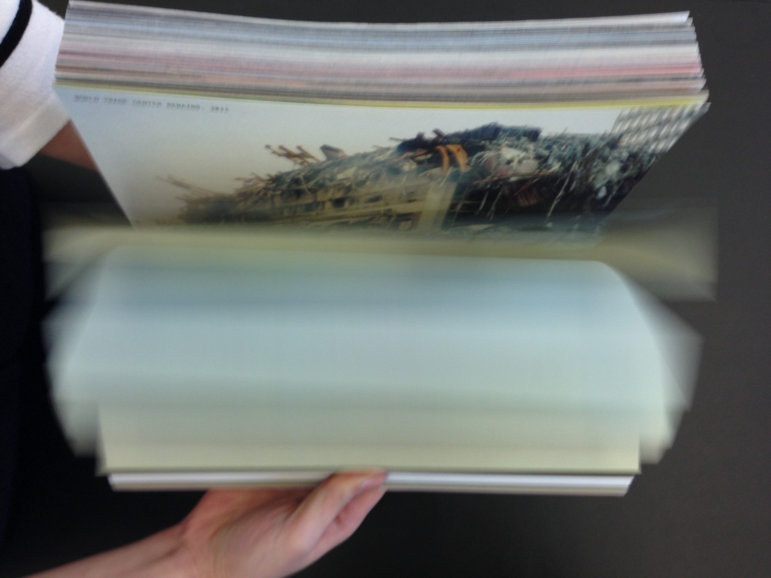
GS: At the end of the last year I interviewed you about your several exhibition projects. You mentioned „the book of colours“. In 2014, as a part of the exhibition How Soon Is Now you designed the book or catalogue titled Catastrophe Colours, a rather bulky book composed of the media images of disasters confronted and physically faced by their inherent chromatic essence – a specific colour. These colours are then named after the associated event – a catastrophe. So, my first question would be: Where did this idea originate?
PJG: Designing with colours feels like a struggle. If a colour is born with material, you don’t have to think much about the justification or the concept. We usually design directly using materials that don’t need any colour finishing. However, this is not always possible for a variety of reasons – from using a material that already exists in space and that needs to be fire-proofed, for example, to economic reasons that make it impossible to use a solid material. What then are the options for choosing their colours? The most commonly used ones are black and white and all the grey shades in between, which could be seen as a way of avoiding the classic old-fashioned beige that comes from the common building stones. So it’s interesting to see that just as yesterday it was colour that somehow mimicked a generic stone, making it look classic, today it’s probably concrete and steel that are calling for us to play with grey tones in the same way.
Then there are some trends in design and architecture to follow. Some of the colours that are making a comeback come from some particular and influential designers, such as some shades of red, blue or yellow from the modernist movements of today. It is difficult to find a powerful justification for the use of these colours. There are a few recipes, but what is missing is a particular alignment with the complexity of what architecture is and wants to be, and – specifically today – with its need to be sustainable. If the material itself is not the colour, then the colour should be another layer, a finishing, a coating that conceals or reveals what is underneath. For many materials there is a need for fire protection or hygienic finishing. If you make it invisible, you show the material, or you can tell it to be the colour you chose. It can be considered as unnecessary decor. And with all decor, it seems it is possible to get rid of the unjustified.
Since we work on many interiors, the question of decor is always present and ready to manifest itself. You create meaning through architecture or design. With interiors, somehow less so. The project was born out of this need to reverse the idea of “free good taste” associated with colours, by creating a tool that inverts the “givenness” of colours.
The text accompanying the later exhibition in 2018 in Munich mentions that this book represents “a colour theory of the present‘”. In comparison to other colour theories based on different phenomena, you have found the source for today’s colour selection in media images of catastrophes. Why do you consider them relevant common narratives of today?
Everyone seems to have a favourite colour. Something that comes from far and wide in every individual’s culture. No one can explain it, it’s kind of like the last inexplicable bit of freedom. Then there’s the somewhat similar other extreme, that each of us is confronted daily with an infinite continuous chain of news about disasters caused mainly by humans. On the one hand, colour is a kind of choice that no one knows where it comes from, this pure free taste, and on the other hand, it is a permanent flux of events, a non-choice that we are permanently confronted with. Thus, as in thinking about the choice of colour, we could engage in avoiding the catastrophes that are almost programmed today. This is an interesting relationship.
It’s about using what we remember from the catastrophe, what could be its dominant colour. These disasters appear in media that also have “coloration” caused by the technology available at the time of the disaster. Black and white photographs, black and white television, camera with film, early colour television, print magazines, the web. A form of trend is thus built up and that could be analysed according to which colours have a certain dominance or saturation. The images that remain in memory are directly influenced by the technology available at the time of the event. The colour is not a mixture of these images of the event, but a single detail that will remain in memory like the taste in the mouth, the famous madeleine.
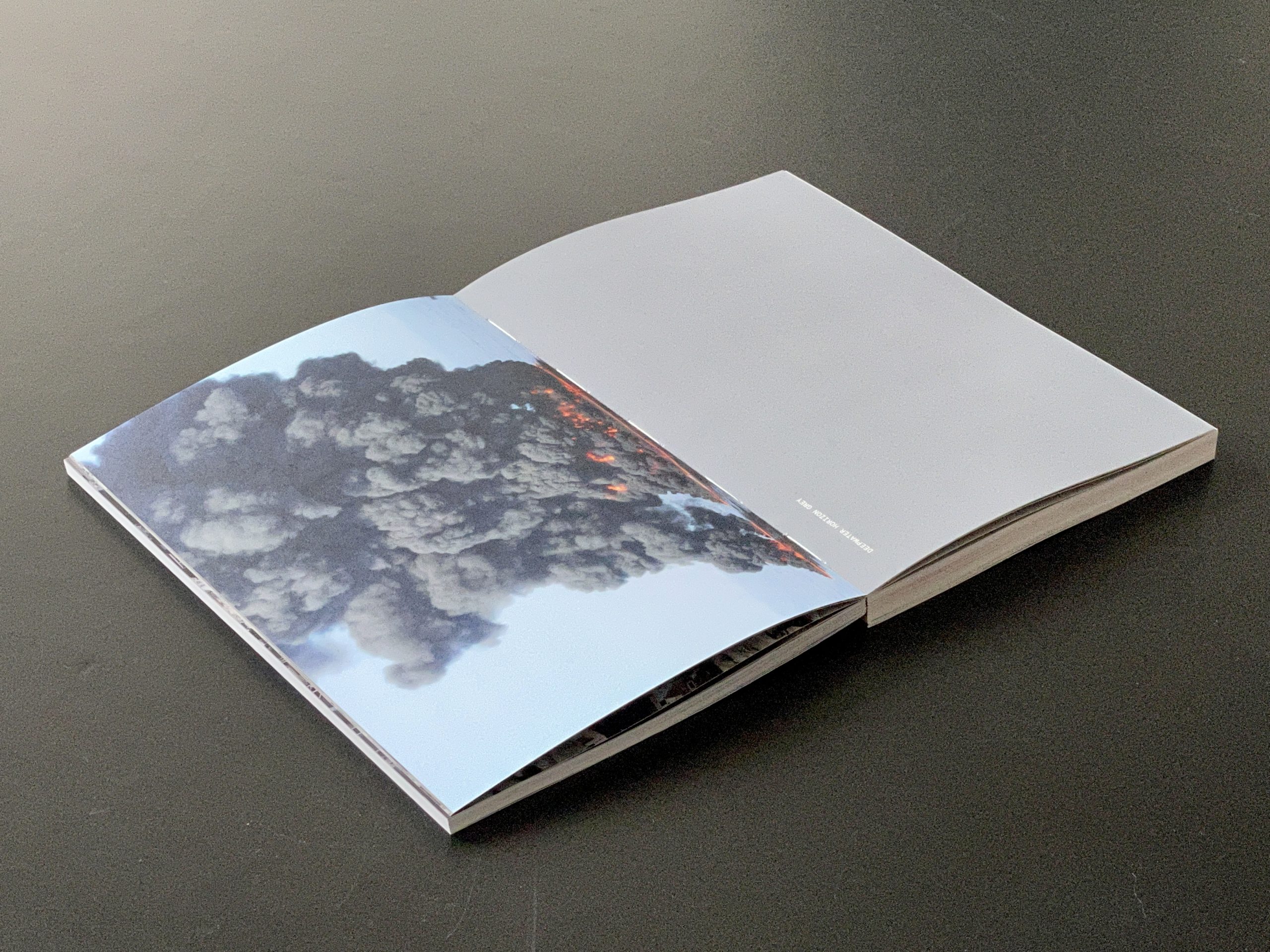
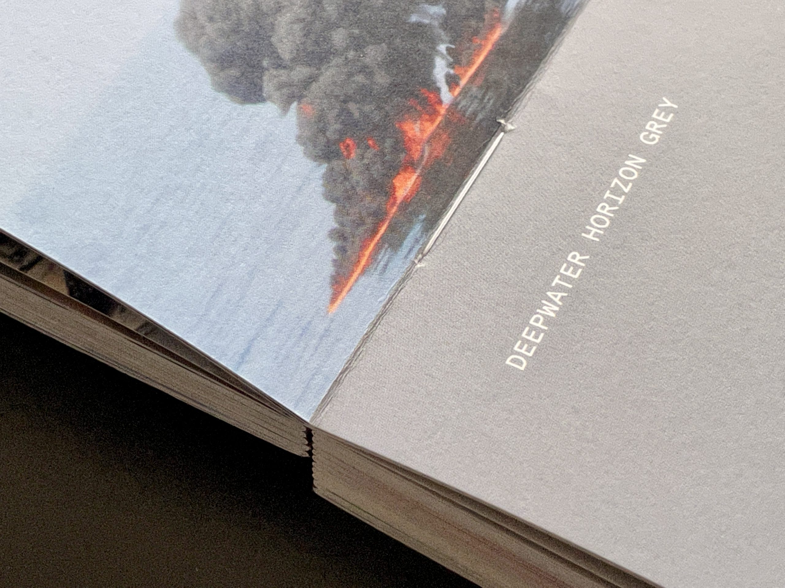
The aforementioned text refers to Le Corbusier’s Claviers des Couleurs [Colour Keyboards]. As I understood, this colour palette by Le Corbusier was for Salubra oil painted wallpapers, so for commercial use and application. Le Corbusier’s Claviers (1st in 1931, 2nd in 1959) were the reaction to uncertainties and inconveniences in precise colour selection resolved by wallpaper. I have found the text accompanying the Salubra wallpapers quite amusing in the context of your book Catastrophe Colours, because it has this commercial ad feeling: “Each of us, according to our own psychology, is driven by one or more dominant colours. Each of us moves towards a particular harmony that our deepest nature requires. The idea was to enable everyone to recognise themselves by recognising their colours.”
In Le Corbusier’s words, using polychromy was “from the beginning of the world” a human’s expression of his or her joy of living and he stressed the ability to recognise oneself through choosing a proper colour palette. So Catastrophe Colours seem to oppose this joyous expression of one’s individuality. Did you make a deliberate departure from individual expression to individual awareness?
It was, of course, totally deliberate. If we look back to the early advertisements for household paints, the pictures, which were only drawings at the time, show a pretty white wife waiting at home for her husband to come home from work. She enthusiastically shows him the paints she has chosen and bought to decorate the house. This was around 1950. Le Corbusier offers his taste to facilitate exactly what no one is sure of: it’s a practical combination of colours based on his own design. Actually, these colours were not that popular in the industry, but with the passage of time they have entered their classic age and became vintage. It is no longer read as avant-garde and can be applied to many other products such as light switches and others. It takes time…
Colour is unquestionably about joy. To mention the paint industry again, you will find only poetic names. It’s amusing to see how every brand for almost the same colour competes in imagination in naming that colour to make sure it has the most poetic version. To challenge this, we might ask how you choose a colour and, ultimately, how that colour recalls a flower, a fruit, or a certain amount of the death. Depending on those references, the colours are then understood in a different way.
As for me, such an aesthetic use of catastrophe pictures also encourages distancing or detachment from that event as such, to a certain extent. On the one hand, it could be a way to raise awareness, or to enhance emotions towards individual colours. Or, on the other hand, it is a way to relieve our mind of these images by replacing them with the associated colour. How do you see this relation between the images of catastrophes and their colour representatives?
This is very interesting. We believe that when a work is complex, it creates many ways to live with it. A bit like a work of art. Of course, there’s no exact answer to how someone integrates that history into a chosen colour. What we find very interesting is the duality between the colour you have to choose and the name of this disaster. Of course, there are no “good colours” in this book, and that’s also very specific. It is a history of man-made disasters that are seen through the images of the media. The best you can do is rank them by how much less deadly it was.
I also see in what you say how we ultimately learn to live with disasters. We know our history, we walk down the street with our lattes, and we pass homeless people all the time. We know it’s not right, but we learn not to think about it for more than a second. It’s kind of a reminder. It’s interesting to see how mayors, instead of helping, just marginalise the undesirables. What we don’t see doesn’t disturb us.
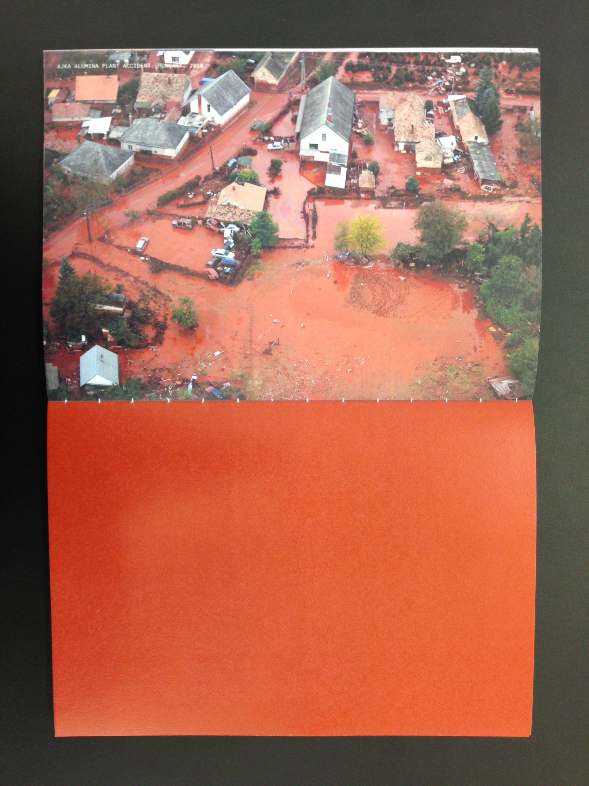
Getting back to Les Claviers once more. Le Corbusier in his purist period with Amédée Ozenfant claimed the primacy of form over the colours. Purist colours were mostly “natural” colours and their use was to enhance the volume. But by the 1930s Le Corbusier had already rethought the function of colours. Even though these Claviers colours from 1930s are still earth tones, the Claviers colours from 1950s are rich and saturated. Even if you mentioned that they weren’t actually very popular at that time. In the text accompanying Salubra wallpapers named Polychromie Architecturale he elevated the role of colours to the “very element of the plan or the section”. It was a kind of liberation of the colour, a way to its autonomy. The palette of Catastrophe Colours was used in the exhibition by other participants to colour different objects. Do you think there is some new or different role of colours (in architecture) today?
I would not see this as a new role, rather I would suggest a reinterpretation of its perception. The use is the same. If you are bored with white walls at home, think about choosing a colour from the palette. But choosing it may take more time. It carries a bit of history, like a monument. It’s the same with an object. The other layer is how, for example, an object created in a particular catastrophic colour will be passed from the first owner to the next and then perhaps one day sold at a flea market. The memory is lost. Just like any other object. On the other hand, my wife, artist Alanna Lawley, says that every object carries its history with it, and that’s why she won’t buy some things from flea markets. To some extent, every second-hand item loses its history depending on how you want or don’t want it.
Colour palettes are not just about the selection of specific colours as such, but about their combinations. Claviers had their own specific mechanism, by which you could choose your preferable colour combination – by using a slider, several colours could be varyingly isolated or combined. But what is the way or tool with which you combine Catastrophe Colours? As was already mentioned, this palette had its use in the exhibition. How were the selections and combinations done?
When we were doing the show with Sam Chermayeff, this question came up. It was obvious that combinations can’t be made just according to colours. Here you could associate all the colours that are related to human mistake with an awareness of its consequences. Every disaster still has an impact on the environment today. The colour criteria can be given according to how you want to read the history database. In the end, such combinations are far more interesting than the good taste of any authority.
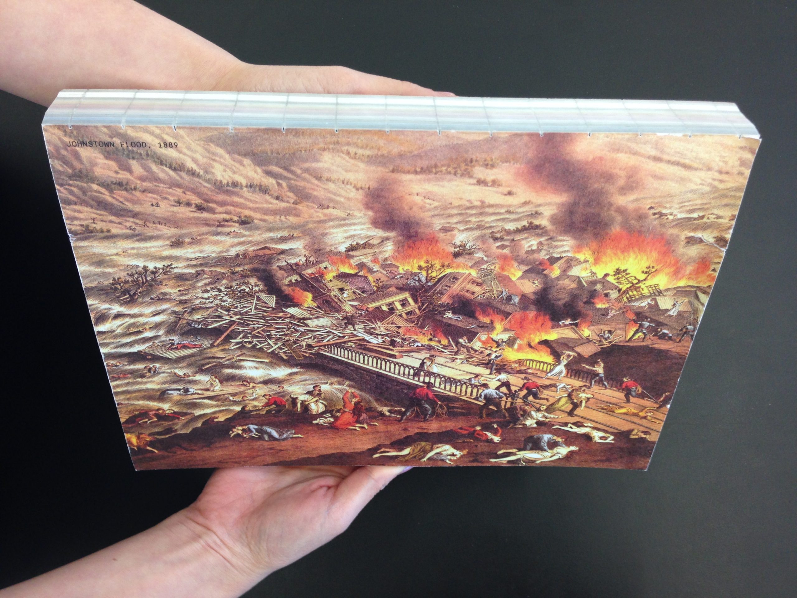
This book was written almost ten years ago. Do you think anything has changed in terms of our “latest colour theory”?
It is rather a history of art or a reading of it, than a theory. It is about how contemporary art is slowly changing the world, how it moves from avant-garde to classic or how it goes back, forgotten, out of date. People change in contact with these ideas. You see new ideas, you slowly get to know them, you understand them, you understand the context, they cultivate you, then you adopt them. It hasn’t changed, but the book is getting thicker and thicker.
The Catastrophe Colours should be a commentary on today’s colour selection in relation to its application. So how do you perceive today’s approach to colour in architecture (if it can be generalised) and what do you find problematic about it?
In many cases, colour paint is a lazy and disengaged solution to renovating the problematic blocks of affordable housing. We have seen this for years, as developers or representatives of the city have added coloured facades. This is not helped by even the subtlest use of colour, whether from le Corbusier’s palette or any other. It still remains a cosmetic, justifying step.
Colours can be functional. The colours inside the hospital obviously have a greater function. Not only for the patient, but also for the surgeon, for example, who needs to relax their eyes with green compensating the focus on the red inside of the body. It is about contrasting. When we look at some projects today, if we see several colours on them, it looks unsustainable, it’s not ecologically thought out. If you see rich tones, from warm brown wood to warm beige stone, then it’s sustainable.
Our book, however, is more a critique than a tool. We’ve become better known in recent years for some of the retail spaces we’ve done, because these businesses communicate its designers a lot. The question is how to meaningfully design a retail space. How do we create a smart space to buy luxury clothing that is not dramatised, kitschy, naive, illustrative or decorative, and ultimately makes the customer feel like being taken for an idiot? We come from the art scene where designing a space for art, for certain art or certain artists, is a tool, a specific idea of architecture, even if it is mainly interiors. It’s about space, it’s about culture, it’s even about what’s going on in the world if you put your mind to it. Ultimately, we wanted these colours to tap into something more complex and force the customer to engage with the today’s world.
How do you handle colours in your work? Do you use Catastrophe Colours as well?
This book is created as a critical tool. We apply it to some of the work we do, but the funny thing is that if you tell a client in a commercial context about picking a few colours out of a book, they may accept it, but in the end what the client’s clients will see is just colour without any meaning. So the book is more about the idea of changing the old symbols of the society and not engaging with those old symbols.
In our work, we like to test a new colour as we test a new material. Or a common material, a common colour. Like beige, for example. We’ll try to find an unexpected logic in the use of this colour. But it’s hard work. You’re pushing it too hard, and then only one colour seems to fit your space. If you mix the colour, then it’s extremely difficult and you feel like you’ve put too much energy into it. Colour doesn’t resolve space for people.
These many aspects in which you challenged the notion of colours are interesting. Illustrating the urge to find and name the relevant arguments for arbitrary choices, even if in the end they may always stay arbitrary. Even if the choice is made consciously in the first step, it can completely lose its former meaning in the second. The colours seem timely, but their use is perpetual.
Yes, this is how it can be perceived. Finally, what is important is also the effort to think of a particular event in a specific moment, whatever it may be, and that it may be based on such a simple thing as the choice of colour.